That Slate shouldn't try to make a chart. What a mess.
So apparently:
-Light green represents enemies wounded because that's kinda good, right?
-Green represents enemies killed because that's good. YAY!!!!
-Light red is civilians wounded because that's kinda bad
-Red shows civilians killed because that's really bad! 
Aha! Brilliant! Style points too, with showing the subtle and meaningful nuance between enemies wounded and civilians killed using a childish color convention. We even have an interactive that lets you subtract the differences. Oh sure, it's perplexing but it's an interactive chart! If we just dig deep enough, we can win the war and have the troops home by Christmas!
This fails on a 3 levels:
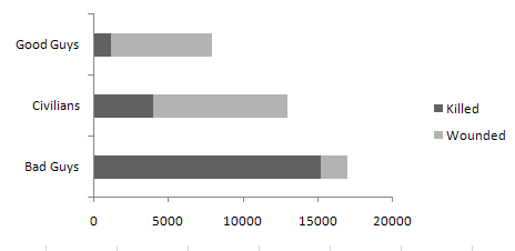
1. Bad medium: the point of using a chart is to make it easier for somebody to interpret a massive amount of data. This doesn't serve that purpose. I don't know what they think that red and green thing is doing, but it sure as shit isn't communicating the difference between enemies/civilians wounded and killed. You read right to left. So it's got that right. But the point of bars is that you compare the values. So I should be able to easily see the difference between total civilian casualties and total enemy casualties right off the bat. To do so, let me introduce you to my good friend clustered bar charts. You could even stack them with the green/light color thing to indicate wounded vs. killed.
2. What are you supposed to learn from that 'interactive' chart at the bottom? I guess it lets you compare some data but it's not like there's any discernible value in subtracting the number of enemies killed from the number of civilians wounded. And even if there were, wouldn't that be a perfect opportunity to use....some color to indicate negative values? Interactive charts are great if they let somebody answer their own questions, but if there isn't a single question you'd ask, don't bother. And if you can't deliver the answer in a fashion that the brain can interpret in a moment or less---scrap the idea. What is there amounts to noise. You might as well put a portal to farmville or something in that spot.
3. Why the scroll bar? Honestly: if you're going to show data over time, the idea is that people can see the trends over time. If you break it up with a scroll bar, you're voluntarily blowing that effect. Granted it's obfuscated by the up/down stuff, but if you spend a couple of minutes you'll notice that the total violence factor goes up in '06, but trying to find that by looking at through 3 peepholes is a hellova lot harder than just viewing all of the data sequentially.
So, quick fix:
The "good guys" numbers come from the iCasualty site for US only.