From a current project: Let's just say you have about 100 rows of this:
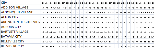
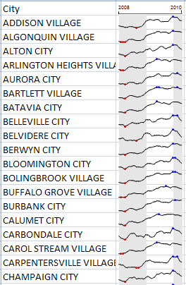
And you want to show it in a way that doesn't give people a total headache. This kind of works.
There's a few things worth mentioning here:
1. The sparkline is showing grey for 08, white for 09, and grey for the available 2010 data. It looks a little off balance because I don't have a crystal ball to tell you what the rest of the 2010 data will be:)
2. The red and blue marks indicate lows and highs respectively. I think most people figure that out in exactly 3 seconds, but I've come across a few folks who don't.
But wait a second! You've shown us how to do incell bar charts! You never said anything about doing it with a line chart!
Totally true. I could show you how to do it, but you're probably best just going and getting the Sparklines For Excel add-in on your own and then RTFM. SFE is a fantastic project that is in the absolutely, positively must have category if you're spending more than 10 hours a week working with data in excel. The addin includes several charts that would work well in the above example and a few that can stand on their own that aren't available in Excel out of the box. Incidentally, SFE can also make a bullet chart which looks something like this:

And is really the best thing since sliced bread for showing your internal KPI's.
What's a sparkline?
Read the wikipedia article for the details.
The term sparkline was proposed by Edward Tufte for "small, high resolution graphics embedded in a context of words, numbers, images".[1] Tufte describes sparklines as "data-intense, design-simple, word-sized graphics".[2] Whereas the typical chart is designed to show as much data as possible, and is set off from the flow of text (as in the box below), sparklines are intended to be succinct, memorable, and located where they are discussed.
If you're a little bored by that explanation and don't really know who Tufte is:
A really tiny chart.
What do I do with them?
Anything you want. I use them on the fly just for getting a quick look at things and as part of several deliverables - although you'll want to spend some time maybe adjusting the colors and the like - even if just swapping the red and the blue in the markers - after all red is universal 'bad' and low unemployment is 'good' so there's a mismatch there. They're also a component of many dashboards because it's so easy to jam pack stuff in a small space.
Bottom line: in many cases you can count that your audience is looking for the high, the low, and a general look at what happened. This shows you all of that in a really tiny space and the audience's brain can interpret it in just a second or two. When placing the sparklines in line with one another and appropriate use of the markers and the shading, it becomes really easy to interpret some basic facts about the data. example: the peek of unemployment seems to be at the beginning of 2010 save for a few cities that seem to have their peek in the middle of 09.
Drawbacks?
- The addin is based in VBA and will occasionally explode
- You need the addin installed to do be dynamic with these. Since you can't count on everybody in the world having the add in, you often times just need to use the handy dandy deactivate sparklines function to render the formulas dead. I think you can also package the macros into a spreadsheet, but probably not the best idea all things considered.
- It can be easy to overdue this stuff. 5 columns of sparklines on the same table might create more noise than you really want.
But I don't like addins and I'm not a big fan of VBA?
I guess that's ok. Excel 2010 includes some onboard sparkline functionality.