This is pretty typical of deliverables I see every day.
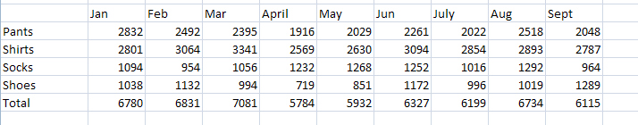
Well, it's not always that bad---usually people can at least take the time to do some alignment. But you get the point. Text really isn't great for something like this because you really can't clearly see highs, lows, trends, whatever. It just is. It's a pretty good place to use a chart, but if you're not a chart ninja, odds are your output will be the defaults, which isn't that much better.
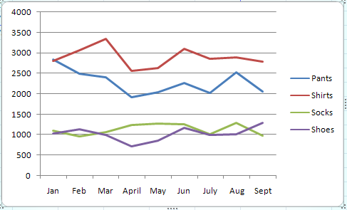
You'd actually have to do quite a bit of fussing with that to make it not suck as bad. So how about something in a pinch---maybe 15 minutes from start to finish.
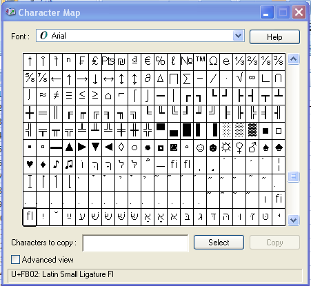
1. Find your character map. It's in every Windows install under accessories.
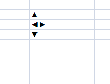
2. Copy the left, right, up, down arrows. Put them in your workbook ----preferably in another worksheet. Name the cells up, down, nochange. I typically put the right and left arrows together for nochange.
3. Insert a column before each month of data.
4. In your first set of blank columns, just insert "=nochange". This should put the left/right arrow thing in the cells.
5. In subsequent columns, the very simple formula: =if(e3-c3<0,down,up) . Or---if month 2 is less than 0, put a down arrow, else just put the up arrow.
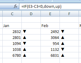
6. Copy and past that formula for each of your empty columns. You'll find that those nifty arrows appropriately populate.
This next part is a pretty obvious shortcut, but a good one. I find conditional formatting formulas to be kind of a pain in the ass. In this example, the heavy lifting is already down in the above formula. You just have to tell excel how to code the result.
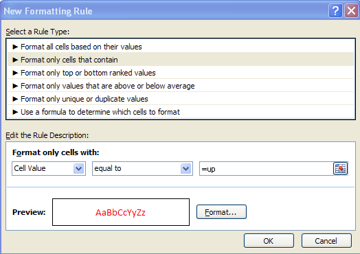
7. Select the entire table---number cells and arrow cells included. (you don't really have to select the number cells, it just saves a bit of time)
8. Create a new conditional formatting rule. 'Format only cells that contain'. For the parameter enter '=up' and select a nice green. Create another rule the same way with the parameter '=down' and select red.
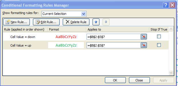
9. Your two rules should look like this:
10. Do some finishing.
-Merge and center the months in the column headers
-Left align your numbers cells
-Shrink your arrow cells
-Play with the font size on the arrow cells until you're happy.
-Fill it with white.
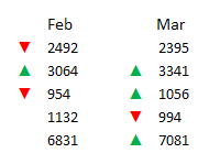
11. Look at your end result.
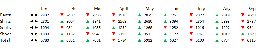
Obviously, not a perfect output.
So the big advantages:
- Hella easy implementation and totally reusable for any subsequent data added
- The coding with he arrow and the color really does make a big difference when trying to make sense of the table. At a glance you should be able to spot that socks had 3 consecutive good months and that July was a down month but August was better.
The big disadvantage:
- You might be coding an insignificant change. To some managers, the difference between 945 sales and 946 sales is pretty negligible.
If you find yourself in that situation, you may have to screw with the equation a bit. For example this:
=IF(E6-C6<negativetolerance,down,IF(E6-C6>positivetolerance,up,nochange))
will add the nochange marker to a tolerance or two that you would specify in a named range.
You could also dump the 'nochange' at the end of that formula and just put a pair of empty quotes, leaving anything within our insignificant change set to just not show anything. After all why bother trying to 'code' nothing - assuming you don't have to.
I do some work for a company that has become virtually obsessed with 'traffic light' style stuff in which people hack colored icons in red/yellow/green. I've seen everything from horrific heat maps, to clip art, to actual pictures of traffic lights. The trouble is, imo, that people seem to have some pretty diverse opinions on whether or not the yellow is kinda good, kinda bad, or neutral. Knowing that, it's really difficult to interpret the use of color at a glance under the 'traffic light' thing, so I find myself encouraging others just to dump the yellow component where it's appropriate. Anyway, moral of the story: sometimes not throwing the icon up there can be just as effective as any representation that you might give it. .